Playpen Sans
Designed by TypeTogether, Laura Meseguer, Veronika Burian, José Scaglione, Kostas Bartsokas, Vera Evstafieva, Tom Grace, Yorlmar Campos
8 weights • Version 22 • On Google Fonts since 2023 • Popularity #1013
Quick Summary
8
Styles
100-800
Weight Range
1
Variable axis
8
Languages / Subsets
© 2023 The Playpen Sans Project Authors
Font Preview
The quick brown fox
Spotted a Font That Looks Like Playpen Sans?
Upload a screenshot or image and we'll find the closest matching free Google Font you can preview and download.
Find Font From ImageAbout Playpen Sans Fonts
Playpen Sans was designed by TypeTogether after over two years of primary research into handwriting education for Latin-based languages, available at primarium.info.
It is a variable font with a weight range from Thin (100) to ExtraBold (800) and supports three different writing systems—Latin, Greek, and Cyrillic—that cover over 700 Latin languages, including Vietnamese and 619 Sub-Saharan African languages, 54 Cyrillic languages, and Greek, along with 26 emoji. The Playpen Sans superfamily also includes an Arabic (Playpen Sans Arabic), Devanagari (Playpen Sans Deva), Hebrew (Playpen Sans Hebrew), and Thai (Playpen Sans Thai) fonts that expand the language support of the system.
Playpen Sans provides seven different glyphs for each character that are automatically applied as you type, using a built-in shuffler that both ensures variety and avoids repetition. This adds to the overall organic, spontaneous, and authentic feel of the handwritten style.
To contribute, see github.com/TypeTogether/Playpen-Sans
A casual handwriting font
Some typefaces do more than one thing well, and others excel at just one thing. The Playpen Sans font family excels at imitating casual handwriting with a completely natural look — the aesthetic form of something made by hand – combined with all the functionality of a professional typeface.
The font world has a general tension between what’s organic and what’s digital. When scribbling a quick note, written letters have slight differences, but all look similar because they come from the same person. Digital typefaces are instead almost always very consistent — each character is exactly the same, every time you type it.
The goal of a typeface that is both casual in look and digital in nature is to appear authentically human within the bounds of digital technology: A typeface with a set of characters that are “the same, but different” that carries the authenticity which everyone craves. The main problem with typical casual fonts is not having enough alternate characters to look real. When a family has more than one alternate, another problem arises in controlling how and when a character gets replaced.
To solve these problems, Playpen Sans was designed with seven versions of each character, plus a novel and automatic shuffler, so no single shape is repeated in close proximity. The result is text with spontaneous inconsistencies that feel fun and organic… all the benefits of a modern, professional typeface that looks natural.
The family was made for non-designers, and it shines within short, informal settings: greeting cards and invitations; casual signs; fun documents, and of course, children’s books and educational materials, comic books, and graphic novels. The straight and curved endings for ‘i, l, y’, the two-story ‘a’, and optional shapes for ‘f, G, I, M’ are notable features.
Playpen Sans combines technological and aesthetic values, showing the best of both worlds with digital capabilities and a casual, handmade look. Is it spontaneous? Is it authentic? Thankfully, yes, and yes.
Greek and Cyrillic
Greek and Cyrillic follow the same principles as Latin, giving the idea that they are all written by the same person. All the writing systems approach letterform construction with casual and continuous strokes; typical stroke boundaries are not always respected due to the relaxed mood of writing; and the in-strokes and out-strokes allow for a natural transition from one letter to the other. Each is a set of clear letterforms that are easy to write and recognize. The design forms a bridge between handwritten and typographic letters, friendly to both little readers and adults.
Emojis
Playpen Sans has emojis for breezy and encouraging uses, that each match the eight named weights of the Latin. Find here the list of all the emojis available. You can copy and paste them into your document editor when using the font. 😉
🌞 😍 ☠ ☹ 😉 ✏ 📖 🏠 ✍ 🧩 🦖 🪐 ✈ 🌠 🎂 🎨 📣 👆 👍 👎 🎯 🪫 ✅ ❌ 🏅 🦄
Who Designed Playpen Sans?
All designersTypeTogether is an independent type foundry committed to excellence in type design with a focus on editorial use. Known for the popular typefaces Adelle and Bree, TypeTogether also creates custom type designs for corporate use, including their work for Google Play Books, Clarín, and Apple.
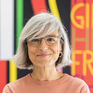
Laura is a freelance graphic and type designer based in Barcelona. She is specialised in all sorts of projects involving custom lettering and type design for branding and publishing design.
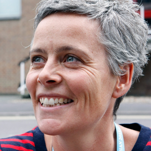
Veronika is a co-founder of the international indie foundry TypeTogether. She is one of the organisers of the alphabettes.org mentorship program, chairwoman of the GRANSHAN project, and organiser of TypeTech MeetUp.
José is a typeface designer, lecturer, and author specialising in typography. He co-founded the TypeTogether font foundry with Veronika Burian, where they have published numerous award-winning type families.
Kostas Bartsokas is a typeface designer and typographer based in Thessaloniki, Greece. He graduated with distinction in Typeface Design from the University of Reading in 2016. Kostas enjoys innovative explorations in Latin, Greek, Cyrillic, and Arabic type design. His typefaces have received several awards including a TDC Certificate in Typographic Excellence. He is one part Foundry5.
Based in Cambridge, UK, Vera Evstafieva is an independent type designer, calligrapher, and consultant who specializes in Latin and Cyrillic type design and lettering. Among Vera’s type designs are: Amalta, winner of the 2011 TDC competition; ALS Direct typeface for interior and exterior wayfinding; Literata Cyrillic for TypeTogether, awarded by Modern Cyrillic 2021; Birra Lambic typeface for Darden Studio’s Birra Flight project, awarded by 2022 Communication Arts magazine competition; Moscow University typeface; Rossica, Apriori, and other typefaces. Vera is a full member of Letter Exchange and has served as a jury member for international type design competitions, including Granshan.
Instagram | letterexchange.org/members/portfolios/vera-evstafieva
Tom Grace is a leading independent typeface and lettering designer based in Lausanne, Switzerland. He holds a Master of Arts in Typeface Design from the University of Reading (UK) and has been creating and optimizing letterforms professionally for over 20 years. Tom has designed and developed hundreds of custom font styles, many for Cyrillic and other non-Latin writing systems, and has published retail typefaces with Monotype and TypeTogether. He also teaches, lectures, and consults on typeface design and development. Tom’s work has earned awards and distinctions for excellence, reinforcing his reputation as a go-to specialist for designers, design agencies, and type foundries in Switzerland and worldwide.
Yorlmar Campos is an architect from the Universidad Central de Venezuela and taught typographic design in the Type Design MA at the Universidad de Buenos Aires where he had previously studied. He has worked on various technical development typographic projects for Google Fonts and his typefaces have been featured in the Tipos Latinos biennial. His font "Atlante," published with TypeTogether, has received five awards, iClap Platinum, Tipos Latinos Certificate of Excellence, D&AD, Gold at the ED-Awards, and the TDC Certificate of Excellence.
Similar handwriting Fonts
Dancing Script
The quick brown fox jumps over the lazy dog
Impallari Type
v29
Pacifico
The quick brown fox jumps over the lazy dog
Vernon Adams, Jacques Le Bailly, Botjo Nikoltchev, Ani Petrova
v23
Caveat
The quick brown fox jumps over the lazy dog
Impallari Type
v23
Indie Flower
The quick brown fox jumps over the lazy dog
Kimberly Geswein
v24
Shadows Into Light
The quick brown fox jumps over the lazy dog
Kimberly Geswein
v22
Great Vibes
The quick brown fox jumps over the lazy dog
Robert Leuschke
v21


