Web designers and copywriters can significantly boost business outcomes by marrying persuasive psychology with conversion-focused design. This guide presents an authoritative, research-backed framework for crafting high-converting websites. We'll explore key psychological principles that drive user decisions, then walk through a proven page structure (from hero sections to FAQs) optimized for conversions. Throughout, we integrate findings from credible studies (NN/g, CXL, Baymard Institute, etc.), A/B test results, and industry benchmarks to justify each recommendation.
Psychological Principles Influencing User Decisions
Understanding how users think and decide is foundational. Effective web design leverages cognitive and behavioral science principles to guide visitors toward conversion actions. Here are core principles and their implications:

Minimizing Cognitive Load
Cognitive load refers to the mental effort required to use a website. Overloading users with too much information, too many choices, or cluttered visuals can overwhelm them - causing them to miss important details or even abandon the task [1]. In fact, when people are faced with excessive complexity or "choice paralysis," their likelihood of converting plummets [2]. To keep cognitive load low and usability high, simplify the experience:
-
Streamline Choices: Focus each page on a single primary goal or action. As conversion experts advise, "there should be only one possible action for the visitor to take… Don't offer [too many] options, or the conversions will suffer" [3]. A classic mistake is sending ad traffic to a busy homepage with many links - instead, use a dedicated landing page with one clear call-to-action (CTA). Fewer decision points means less mental effort and higher conversion likelihood.
-
Reduce Visual Clutter: Avoid unnecessary elements that distract or confuse. Extra menus, irrelevant images, or decorative flourishes add "extraneous cognitive load" and slow users down [4]. Every element on a high-converting page should serve a purpose. As Nielsen Norman Group notes, redundant links or meaningless graphics end up impairing usability [5]. White space and clean design, on the other hand, help users focus on key content by removing noise [6] [7].
-
Fast & Predictable Interactions: Performance issues also affect cognitive perception. Slow-loading pages not only frustrate users but subconsciously erode their sense of the site's competence [8] [9]. Research shows that a jump in page load time from 1 to 3 seconds makes users 32% more likely to leave [10]. Prioritize quick load times and ensure buttons, forms, and links behave in expected ways. Consistency in navigation and interface patterns helps users form familiar mental models, so they don't have to "learn" how your site works [11].
-
Chunk and Clarify Content: Large walls of text deter users who typically scan rather than read thoroughly. Studies by Nielsen Norman have long shown that users skim web content in F-shaped or layer-cake patterns, seeking salient headings and bullet points [12] [13]. Keep paragraphs brief (3-5 sentences) and break information into digestible sections. Use descriptive headings, bullets, and visuals to facilitate scanning. For example, instead of a dense feature list in prose, use a bulleted list of key benefits - this improves readability and retention, as validated by eye-tracking studies [14] [15].
Ultimately, minimizing cognitive load means making it effortless for users to understand your value proposition and take action. Remove anything that introduces doubt, delay, or difficulty in that journey. By accommodating the limits of human attention and working memory, you "free up" mental resources so users can focus on converting [1] [16].
The Power of Social Proof
Humans are profoundly influenced by the behavior and opinions of others. Social proof leverages this herd instinct by showing that "people like you" have had positive experiences with the product or service. In practice, this includes testimonials, reviews, case studies, client logos, usage statistics, and any evidence of wide acceptance. Why is social proof so critical? It provides validation and reduces perceived risk: users gain confidence that if others trust and benefit from your offering, they will too [17] [18].
Key research findings underscore social proof's impact on conversion:
-
Displaying testimonials or reviews can yield dramatic conversion lifts. In one A/B test, adding just three brief testimonial quotes to a landing page increased conversions by 34% [19]. Another study found that adding customer testimonials to product pages boosted sales conversions by 190% for lower-priced items and an astonishing 380% for higher-priced items, where trust was an even bigger barrier [20]. The higher the cost or commitment, the more users rely on others' experiences before deciding.
-
Quality and relevance of social proof matter. Vague, generic praise ("Great product!") is far less persuasive than specific, relatable stories. Research in the Journal of Consumer Research found that testimonials with concrete details, relevant scenarios, and relatable identities generated 68% higher trust and engagement than generic reviews [21]. In other words, a testimonial that describes how a problem was solved and comes from someone similar to the reader (e.g. same industry or role) is most credible [22]. Highlight details that will resonate with your target audience's pain points and demographics.
-
Attention and format: Not only do testimonials build trust, but how you format them affects whether they're noticed. Eye-tracking research by Nielsen Norman Group revealed that testimonials presented with "scannable trust structures" - i.e. a visually highlighted quote or summary - received 74% more attention than traditional paragraph-format testimonials [23]. Effective designs use visual cues like quotation marks, bold key phrases, or author photos to make testimonials stand out during a quick scroll. For example, many high-converting pages use short quote call-outs or rotating testimonial carousels to catch the eye and convey social proof even to scanners.
-
Bandwagon cues: Aggregate statistics and indicators of popularity can also trigger the bandwagon effect. Showing the number of customers, downloads, or subscribers sends a signal that "lots of people use this." One guide on trust signals notes that prominently displaying usage stats (e.g. "Over 5,000 clients" or real-time purchase notifications) can create a bandwagon appeal where visitors are more inclined to join in [24]. We find comfort in following others' actions [25], so showcasing evidence of widespread adoption can nudge undecided users toward conversion.
In practice, weave social proof throughout the page. A common approach is to introduce some validation near the top (for credibility at first glance) and more in-depth proof as the user scrolls. For instance, many successful landing pages show a row of client logos or a short testimonial blurb near the hero section, then later include a dedicated "What our customers say" section with detailed quotes and maybe photos. The goal is to anticipate skepticism ("Does this really work?") and answer it with voices of real users. By strategically using social proof, you address users' emotional need for reassurance and leverage the psychological pull of consensus.
Building Trust and Credibility
Trust is the currency of conversion - without it, even the best offer will falter. Users arrive at a new website with a skeptical mindset and a low baseline of trust [26]. According to Nielsen Norman Group research, visitors "almost always approach a new website with a skeptical mindset… They expect to be disappointed" [26]. Thus, your site must work quickly to establish trustworthiness and signal credibility before visitors feel confident enough to take action (fill out a form, enter credit card info, etc.).
Design for trust by addressing both surface-level and substantive credibility factors:
-
Professional Design & First Impressions: Users form an opinion about a website's credibility within seconds of landing on it. A clean, professional appearance can immediately convey that your business is legitimate and competent. In fact, Nielsen Norman Group emphasizes that the first step to garnering trust is to make your site appear legitimate and professional, with well-organized layouts, appropriate color schemes, and high-quality imagery [27] [28]. Conversely, outdated design, poor spelling, or broken elements can destroy trust in an instant. One user in a study noticed a typo on a homepage and said it "can change my impression…this is their face to the world; such simple stuff can change my feelings toward them" [29]. Attention to detail in design and copy signals to users that your business is competent and cares about quality.
-
Upfront Transparency: Be forthright about information that impacts the user's decision - pricing, fees, what's included, shipping times, return policies, contact info, etc. Hiding or omitting critical details is a quick way to lose trust. Nielsen research found that when sites omitted basic information, users almost immediately ruled them out in favor of more transparent competitors [30]. For example, in one usability test a participant left a cleaning service's site after 35 seconds because it didn't list rates up front: "I would definitely not use [this site] because they don't state the rate here… they want us to write to them. They are not open enough" [31]. The lesson is clear: if users suspect you're withholding something or forcing them to dig for basic facts, they'll assume the worst. Prominently display key info and make it easy to find answers (through an FAQ section or clear links) to preempt common objections. Honesty and clarity build trust, whereas surprises and "gotchas" kill it.
-
Trust Signals and Badges: Incorporate visual trust cues that reduce perceived risk. Security badges (SSL seals, credit card logos, etc.), privacy certifications, money-back guarantee symbols, and awards or affiliation logos all serve as third-party endorsements of your legitimacy. These trust signals work on a psychological level by borrowing the authority or assurance of well-known entities. For example, the Baymard Institute found that nearly 1 in 5 users (18%) have abandoned an online purchase because they didn't trust the site with their credit card info [32]. Users often don't understand technical security, but they do feel safer when they see familiar security logos (e.g. Norton Secured) or even a simple padlock icon on the site [33]. Baymard's studies on trust seals show that the presence of a known security badge can substantially improve users' "gut feeling" of safety [34]. In fact, among various seals tested, the Norton Secured seal was consistently ranked most trusted by consumers, far outperforming lesser-known seals [35]. Beyond security, things like Better Business Bureau accreditation, industry awards, or media mentions ("As seen in…") can also reinforce credibility. Sprinkle these signals near conversion points - for instance, near a signup form or CTA button, you might show a lock icon with "Secure Checkout" or a short line like "Trusted by 500+ companies" to allay anxiety.
-
Client Logos and Endorsements: Particularly for B2B or service businesses, showcasing logos of well-known clients or testimonials from respected figures adds authority (another of Cialdini's principles). Seeing that reputable brands or experts trust your company creates an association of credibility. One conversion study noted that for B2B companies, displaying prominent client logos is one of the most valuable trust signals - it helps "attract more of the same" caliber clients by signaling that you already work with established brands [36]. Similarly, if you have influencer or celebrity endorsements relevant to your industry, featuring those (with permission) can boost trust via authority bias. The key is to use real, verifiable endorsements - users are savvy and can detect generic or fake testimonials, which will backfire. Always pair a testimonial with a name, photo, title, or other identifying info (unless confidentiality is an issue) to increase its credibility.
-
Content Quality and Accuracy: Ensure all content on the site is up-to-date, accurate, and useful. Stale blog posts from years ago, missing contact information, or half-baked product details can erode trust. Users notice when a site's content appears neglected or out-of-date [37] [38]. Regularly update your content and demonstrate domain expertise through clear, informative copy. This includes product/service descriptions that set correct expectations and honest comparisons or use cases. If applicable, providing case studies or data that back up your claims can further increase credibility (e.g. "XYZ software helped Company A increase leads by 30% in 3 months"). In short, be the reliable source of information about your offerings.
-
Social Proof as Trust: Social proof (previous section) is actually a subset of trust signals - it provides peer validation. Testimonials and reviews not only persuade, they reassure, acting as "credibility by association." According to one UX strategist, "social proof manages objections" by answering the question "Has this worked for others?" [39]. When users see others vouching for you, it mitigates their fear of making a wrong decision. Thus, social proof and trust-building content work hand-in-hand to overcome the natural skepticism of new visitors.
All these elements create an overall impression of trustworthiness that is essential for conversion. As one Nielsen Norman Group summary put it: websites must establish trust and present themselves as credible "to turn visitors into customers." The methods for doing so (professional design, disclosure, fresh content, external connections) have remained consistent over decades [40]. Importantly, trust is often felt subconsciously - a culmination of many small cues that together make the user feel "this site is legitimate and cares about my experience." Aim to satisfy that gut check at every turn. (And remember, trust lost is hard to regain - so avoid any dark patterns or misleading tactics that might boost short-term clicks at the expense of long-term credibility.)
Guiding User Attention
Grabbing and directing user attention is crucial in driving conversions. Even if your content and offer are stellar, they must be seen and absorbed by visitors who are often impatient and easily distracted. Here we consider how to optimize for the way users visually browse pages:
-
Above-the-Fold Impact: The "fold" - the portion of the page visible without scrolling - still matters for first impressions and engagement. Studies using eye-tracking have quantified this: according to Nielsen Norman Group data, the top of a page gets disproportionate attention. The pixels just above the fold are viewed 102% more often than those below the fold [41]. Similarly, an analysis by Google found that content shown above the fold enjoys a 73% visibility rate versus only 44% for content immediately below the fold [42]. This doesn't mean users never scroll (they do, as we'll discuss), but it underscores that what users see first strongly influences whether they stay or bounce. Your above-the-fold area should thus immediately communicate value and relevance (through a strong headline/hero - see next section) to entice users to engage further. It's also wise to include a clear call-to-action or at least a signpost toward action near the top for ready-to-act visitors.
-
Encourage Scrolling (Don't "Dead-End" the Fold): While above-the-fold content should be compelling, avoid trying to cram everything into that space in fear that no one scrolls. In fact, countless tests and scroll-tracking studies have debunked the myth that "people don't scroll" - they will scroll as long as they know more content exists and promises value [43]. The real enemy is the false bottom, where a page's design makes it look complete when it isn't, causing users to miss content below [44] [45]. Use design cues to indicate there's more to see (for example, a partial cut-off of an image or section heading peeking above the fold, or an arrow/down chevron icon). Copywriting legend Joanna Wiebe advises: "Don't cram everything above the fold… visitors are willing to scroll as long as they know there's something to scroll down for." [43]. So, absolutely make your top section engaging, but let it act as a teaser that invites scrolling rather than an attempt to fully convince in one view.
-
Strategic CTA Placement: A perennial debate in conversion design is whether the primary CTA (like "Sign Up" or "Get Started") should appear above the fold or after some content. The answer: it depends on user readiness and page context. If your audience is already highly motivated or familiar with your offer (say they clicked a targeted ad or email, or you're a well-known brand), an immediate CTA at the top can capture those who are ready to act now [46] [47]. However, if users need more education or persuasion to see the value (common for new brands, complex or high-price products), they may not click a CTA seen too early. As Unbounce co-founder Oli Gardner suggests, asking for action "can be expecting too much of someone who has just arrived at your page." A solution he offers is to include a mini landing page worth of info above the fold - headline, value proposition, perhaps a striking visual or benefit bullet - along with a CTA, so that section itself gives enough context [48]. Users who are convinced can click immediately, while others can scroll for details. Another CRO expert, Brian Massey, notes that the most important content usually should be early, but "if you're not well known, or you're in a new industry and need to do a little education first, it's okay to save the call to action until you've made some key points" [49]. In practice, many high-converting pages employ multiple CTAs: one at the top (or a sticky header button) for the eager segment, and another mid-page or at the bottom after the value has been explained. Repeating the CTA ensures that once a user is convinced, there's a conversion trigger immediately available without scrolling back up [50].
-
Copy Length vs. Attention Span: There is no one-size-fits-all answer to how much content to include before asking for conversion - it must align with the visitor's needs and the offering's complexity. A general heuristic: short pages for low commitment offers, long pages for high commitment. MarketingExperiments.com identifies three factors that dictate needed copy length: the visitor's motivation level, their initial anxiety or skepticism, and the cost/commitment of the conversion [51]. If you're offering something free or simple (newsletter signup, free trial), you can get to the point quickly with a concise pitch - users don't need to read a novel to give an email when risk is low [52]. But if you ask for significant money or a long-term commitment, users will require more information and reassurance, which means their eyes will travel further down the page. Don't be afraid of long-form content when appropriate. Studies have shown longer landing pages can outperform shorter ones in cases where more copy addresses key questions and builds trust (for example, an famously successful case study by Conversion Rate Experts involved increasing a landing page's length to include more info, which improved conversions [53]). The caveat is that the content must remain engaging and structured for scanning - long copy works by systematically eliminating doubts (through explanations, data, testimonials, FAQs), not through sheer volume of words. As one expert quipped, "Don't hate the length; hate the content" - meaning a user will read a lot if it's genuinely helpful and relevant, but will tune out even a short page if it's filled with fluff [54].
-
Visual Hierarchy and Focus: Use design principles to guide the user's eyes to what matters. On a well-designed page, a visitor's gaze should naturally flow through the story you want to tell, rather than jumping randomly. Generally, users follow an F-pattern on text-heavy pages (scanning left to right at the top, then down the left side, with shorter horizontal glances) or a Z-pattern on pages with more evenly distributed graphics (eyes move in a Z shape across the page) [55]. Leverage this by placing important elements along these natural paths. For example, a common layout is a prominent headline at top (first horizontal line of the "F"), a supporting image or tagline near the center, and a CTA button towards the right (catching the eye as it moves across). Visually, make the CTA unmissable - high contrast color, ample white space around it, and maybe an arrow or directional cue pointing to it. The CTA should "dominate the visual layout" among other elements [56]. Likewise, use size and contrast to establish hierarchy: larger, bold text for headlines; subheadings for sections; and shorter line lengths or bullet lists for key points, so that even a quick skim picks up the main messages. Images or illustrations should be chosen not just for decoration but to draw attention to or reinforce the key message (for instance, showing the product in action, or an arrow in an image literally pointing at the signup form). The goal is to create an intentional visual narrative - one that captures attention with a bold value proposition, then successively guides the eye through supporting points (benefits, proof, details), and ends on the conversion action.
In summary, winning the attention game means front-loading value, making it obvious that your page is worth the visitor's time, and then smoothly leading them to the point of conversion. By balancing above-the-fold impact with encouraging exploration below, and using visual hierarchy to emphasize what's important, you ensure that your carefully crafted content actually gets seen and absorbed by users on their path to converting.
Persuasion Triggers (Urgency, Scarcity, and More)
Beyond the fundamentals above, high-converting designs often employ persuasion triggers rooted in behavioral science to tip users from consideration to action. Two of the most common are urgency and scarcity, which play on the human bias toward avoiding loss:
-
Urgency & Scarcity: These tactics leverage the principle of loss aversion - people are motivated to act quickly if they fear an opportunity might vanish. In practice, this could mean highlighting limited-time offers ("Sale ends tonight"), low stock warnings ("Only 2 left in stock"), or upcoming deadlines ("Register before seats run out"). When used authentically, these cues create a now-or-never momentum that can significantly improve conversion rates [57]. However, it's crucial to be truthful; false scarcity (e.g. fake countdown timers or endlessly extended "last day" sales) can damage trust once users catch on. When genuine, though, adding a time pressure or quantity limit can push hesitant users to decide instead of procrastinating. For example, e-commerce A/B tests commonly find that showing stock scarcity (like displaying remaining inventory) or shipping countdown timers yields higher checkout rates, precisely because users don't want to miss out. Use these techniques judiciously and in line with your brand reputation.
-
Personalization & Relevance: A more user-centric trigger is relevancy - people convert when the offer feels tailored to them. Behavioral marketing research suggests that even subtle personalization (like dynamically inserting the user's city, or showing content related to what they viewed before) can increase engagement. On landing pages, this often translates to message matching and segmentation. Ensure the headline and copy match the ad or email the user came from, echoing the same keywords or pain points (this is sometimes called "scent matching" and it reassures users they're in the right place [58]). If you serve multiple audiences, consider creating variant pages or at least sections that speak directly to each persona. For instance, if you have both small business and enterprise visitors, you might include testimonials or case studies labeled for each ("See how a small business like yours used our product…" vs "Enterprise success story"). Showing people examples of similar others (as noted in the social proof discussion on identity resonance) increases the likelihood of conversion [22].
-
Commitment & Consistency: Another psychological lever is to get users to take a small initial step that makes them more likely to take further actions. This is related to the foot-in-the-door technique - once someone says yes to something minor, they are subconsciously inclined to stay consistent with that commitment. In web terms, offering a free trial or a sample can serve this purpose. For example, many SaaS sites use a "Start Free Trial" CTA rather than "Buy Now" for first-time visitors, because it's a lower-friction ask. Once the user signs up (small commitment), they've invested time and effort, making them more receptive to upgrading later. From a design perspective, ensure that this initial conversion step is as easy as possible (minimal form fields, clear value immediately after signup) to maximize uptake. As CXL's Peep Laja advises, if your product is expensive or complex, focus first on getting the user's contact info and permission to engage further, instead of pushing for an immediate sale [59].
-
Emotion and Storytelling: Remember that conversion decisions are not purely rational - emotions play a huge role. High-converting pages often use storytelling elements or emotive imagery to connect with users' feelings. For example, a hero section might vividly paint the pain point ("Tired of juggling projects and missing deadlines?") and then offer hope ("It doesn't have to be this way - we have the solution"). This narrative arc can hook users on an emotional level. Likewise, using photos of happy customers, or aspirational imagery of the outcome (people using your product successfully), can instill positive feelings. Emotional design principles (color, imagery, tone of voice) should align with the desired feeling - whether it's urgency, optimism, trust, or exclusivity. Attention to these subtleties can improve conversion by making the experience more compelling than a dry factual approach. (One caveat: always test emotional appeals, as different audiences respond uniquely - what inspires one group might come off as cheesy to another.)
By integrating these behavioral triggers in an ethical way, you add extra "pressure" on top of your solid foundation of usability and trust. Urgency and scarcity prod users to act now, personalization and social proof reassure them "this is for you," and small commitments pave the way for bigger ones. Used together, they create a persuasive environment where not converting would feel like a missed opportunity.
With the psychological groundwork laid, let's move on to the page itself - assembling these principles into a cohesive layout that maximizes conversions.
Proven Page Structure for Maximum Conversions
While every website is unique, high-converting pages often follow a similar structural formula. This structure is born from years of A/B testing and UX research, reflecting how users typically consume information and make decisions. Below, we outline the key sections of a conversion-focused page (particularly for a homepage or dedicated landing page), explain the rationale behind each, and provide best practices backed by research.

Overview of the High-Converting Page Anatomy:
-
Hero Section (Value Proposition & Primary CTA) - First screen users see; includes headline, sub-headline, supporting visual/media, and a clear call-to-action.
-
Social Proof / Trust Indicators (Early Validation) - Reinforcing credibility near the top, often via client logos, awards, or brief testimonials.
-
Features/Benefits Section - Expands on what you offer and, importantly, how it benefits the user; may include bullet points, icons, or short paragraphs.
-
Detailed Social Proof (Testimonials/Case Studies) - A section dedicated to customer success stories or quotes that handle objections and build trust.
-
Objections Handling (Guarantees, Objection-Rebuttal Copy) - Content that addresses common doubts (e.g., "What if it's not for me?"), including things like FAQs or comparison info.
-
Secondary CTAs - Repeated conversion opportunities after the user has scrolled through content, ensuring an action prompt is always available when the user is ready.
-
Footer with Reinforcement - Often includes another small sign-up form or CTA, plus supplemental links (detailed FAQ, contact info, privacy policy - these also serve trust and legal needs).
Let's dive into each section and discuss how to execute it effectively:
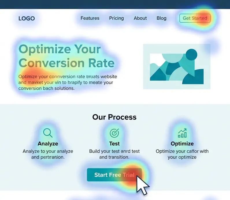
Example of an effective hero section from Basecamp's landing page. The design uses a bold headline addressing the pain point ("Wrestling with projects? It doesn't have to be this hard.") alongside visual cues of disorganized tools, immediately conveying the value proposition of simplicity over chaos. A bright call-to-action ("Try Basecamp Free") is placed prominently, capitalizing on the visitor's attention at the top.
1. Hero Section: Your Value Proposition Front and Center
What it is: The hero section is the top portion of your page - typically what is visible without scrolling. It includes the main headline/tagline, a supportive sub-text or value statement, possibly a striking image or graphic, and the primary call-to-action button. Think of it as your elevator pitch for the website, combined with a billboard-style visual impact.
Goal: Capture attention immediately and communicate within seconds what your business offers and why the visitor should care. Nielsen Norman Group has noted that visitors spend just seconds evaluating a page to determine its relevance [60]. If the value isn't clear instantly, they may bounce. Therefore, the hero section must answer the user's fundamental questions at a glance: "Does this site have what I'm looking for? What value or solution is being offered? Can I trust this brand?" [61].
Best Practices (Backed by Research):
-
Benefit-Oriented Headline: Your headline should prominently state the core benefit or value proposition, rather than a generic welcome. Users often only read the headline and maybe a few words around it, so it must convey what you do and why it matters. According to ConversionXL, the headline is the most important element of a landing page and should ideally echo the promise that brought the visitor here (e.g., if an ad mentioned a "breakthrough solution," the headline should repeat that phrase) [58]. An effective headline is clear and specific - for example, "Project Management Made Easy for Remote Teams" is better than "Welcome to Our Platform" because the former tells the user exactly what they gain. Clarity trumps cleverness; usability studies show that users won't decipher a cute but vague tagline under time pressure [60].
-
Supporting Subheader or Tagline: Under the main headline, use a brief subheading or sentence to elaborate slightly - often this might mention who it's for or add a concrete detail. For instance, a headline might state the promise ("Double Your Email Conversions"), and a subheader could add "with our AI-driven optimization tool in 30 days or less." This combination delivers a one-two punch of value and specificity. Keep it concise and focused on the user's needs (use second person "you/your" where possible).
-
Strong Visual (Hero Image or Video): Humans are visual creatures, and the hero image can instantaneously convey context or evoke emotion. Use an image that supports your message - perhaps showing the product in use, the outcome of the service, or a relatable scenario. Ensure the visual doesn't distract from the headline but rather complements it. For example, if your product is software, showing a screenshot or an illustration of someone happily using a computer can work. If it's a service, maybe a photo of your team or customers (real, not just a cheesy stock photo) helps personalize it. Authenticity in imagery boosts trust: one case noted that using genuine photos of your team or product can build a connection, whereas generic stock images add no value [62] [63]. Aim for images that set the right tone - whether that's friendly, professional, cutting-edge, etc., aligning with your brand.
-
Primary Call-to-Action Button: The hero should almost always feature the main CTA - be it "Sign Up Free," "Get a Quote," "Start Trial," etc. This button ought to stand out in color (use a high-contrast color not heavily used elsewhere on the page [64]), be large enough to notice, and include action-oriented text ("Get Started Now" is more compelling than "Submit"). Placing it early caters to ready-to-buy visitors and also signals the page's purpose. However, as discussed, if your offer is complex, it's wise to also include a cue that more info is below (so users know they can scroll to learn more before clicking). Some designs use an arrow pointing down or a short "Learn more below" message - these can be helpful.
-
Optional Elements: Depending on your business, you might include additional trust elements in the hero. For example, a top navigation bar is often minimal or omitted on dedicated landing pages (to reduce distraction), but on a homepage it might be present in slim form. Either way, avoid a heavy nav menu that pulls attention away (removing or simplifying navigation can lift conversions by keeping users focused [65] [66]). You could also include a short social proof snippet in the hero, such as "Join 10,000+ marketers using XYZ" or media badges ("Featured in Forbes, TechCrunch…"). These can quickly add credibility without requiring a scroll, which is valuable because trust needs to be established early [40]. Just be careful not to clutter the hero with too many disparate elements - maintain a clear visual hierarchy where the headline and CTA are still the stars.
Why it works: The hero section leverages the psychological principles of attention (it's designed to grab eyeballs and not overload them) and clarity. Users typically decide whether to stay on a page within 10 seconds or less - some say even within the first 5 seconds. A Stanford study indicated that visual appeal and clarity of purpose in those first moments can determine if a user trusts and continues with a site [34]. By immediately communicating value and showing a relevant solution, you tap into the user's existing motivation (they likely clicked a link hoping to solve a problem) and confirm "Yes, you're in the right place." And by providing an easy next step (CTA), you allow impulse action for those ready. As Peep Laja summed up: "Clarity trumps persuasion" in the initial moments [67]. A clear hero doesn't have to fully persuade on its own - it just needs to hook the visitor into exploring further or converting right away.
2. Early Social Proof and Trust Signals
Immediately after (or integrated into) the hero, it's wise to place some trust boosters. Users' skeptical filter is highest when they first arrive, so offering quick reassurance can increase the chance they'll continue down the page. This section isn't always explicitly labeled; often it appears as a strip or small area with logos, a tagline of accomplishments, or an award.
Components and Tactics:
-
Client/Partner Logos: A common pattern is a horizontal band showing logos of well-known clients, partners, or publications that have mentioned the company. For example, you might see "Trusted by" or "Our clients:" followed by logos like Google, Amazon, etc. If you have recognizable brands as users, flaunt them here. Seeing those logos provides instant third-party validation, leveraging the credibility of those brands. Research in B2B contexts has noted that such displays help attract similar clients by signaling you're already vetted by industry peers [36]. Even for B2C, statements like "Over 1 million customers - including teams at Nike, IBM, and Dropbox" combines social proof with authority, covering two bases at once.
-
Statistics as Proof: If you have impressive numbers, consider highlighting them briefly. E.g., "10,000+ businesses served," "98% customer satisfaction," "#1 in our category on G2Crowd," etc. Make sure any stat is truthful and up-to-date (and ideally cite the source subtly if needed, like linking to a review site). Bold numbers draw the eye, and users love tangible evidence. A data point like "70% of our trial users upgrade to paid within 14 days" (if true) can be very persuasive, as it implies high value. Remember the bandwagon effect: showing a large user base or results achieved can influence new visitors to join in [24].
-
Security/Trust Badges: If not already in the header, placing small security icons or trust seals near the top can help especially for e-commerce or any page asking for personal info. For example, a "Secure Checkout" padlock icon, or "GDPR compliant" notice. Baymard Institute's research indicates that users look for trust signals especially when they're considering inputting sensitive data [33]. While the actual checkout might be later, planting those cues early can reduce anxiety throughout the session.
-
Quick Testimonials or Endorsement Blurb: Some pages show a one-line testimonial or a star-rating aggregate near the top. For instance, a line like: ★★★★★ "Rated 4.9/5 by over 500 customers" or a short quote like "Game-changer - I doubled my sales in a month! - Jane D." If you have a marquee customer or influencer endorsement, you might feature a snippet of it here with a photo or name (this leverages authority and social proof). Eye-tracking studies show that users do notice a well-formatted testimonial box even high on the page, because it often stands out visually and contains quotation marks or a different background color [23]. Keep it very short at this stage - details will come later in a dedicated section.
-
Navigation/Contact Info: Though not exactly "social proof," another trust element often placed in the header area is clear contact info or a link to "About Us." A visible phone number, chat button, or at least an easily found contact link signals that there are real people behind the site and that help is available. Nielsen Norman Group found that prominently displaying contact information (even just in the top utility bar or footer) adds to credibility - users equate it with transparency [68]. If a visitor is on the fence, knowing they can reach out or see who's behind the company (via an About page) might tip them toward engaging rather than exiting.
Rationale: These trust elements address the subconscious questions "Can I trust this site/business?" and "Do others find this valuable?" right up front. Since new visitors are, as noted, often skeptical by default [26], showing cues of credibility in the first screen can prolong their attention. It's akin to meeting someone and immediately presenting a reference or credential - it builds confidence to continue the conversation. In quantitative terms, establishing trust early can reduce bounce rates and increase "time on page," giving your persuasive content a chance to work. For example, if a user doesn't quickly find something that signals legitimacy, they might bounce within 10-20 seconds (a common timeframe for cursory page evaluation [60]). But seeing, say, the logos of reputable companies or a testimonial might make them think "Okay, looks like this is a credible player; I'll read a bit more."
Moreover, by incorporating social proof here, you're starting to handle objections preemptively. Objection: "Has anyone actually gotten results with this?" Answer: "Yes, look at these companies/users just like you." Objection: "Is this a scam or untrustworthy site?" Answer: "We are endorsed by X, secured by Y, and easily reachable." This doesn't fully convince on its own, but it sets a positive tone that makes the visitor receptive to the information in the next sections.
3. Features and Benefits Section
After hooking the user with the hero and giving them initial trust cues, the next section should explain what you offer in more detail and how it helps the user. This is where you answer, "Okay, but what exactly do I get? How does it work? Why is it useful?" in a digestible way.
Key Elements:
-
Benefit-Focused Copy: Rather than just listing features (attributes of your product/service), frame them as benefits (value or outcomes for the user). For example, a feature is "Automated email scheduling," but the benefit is "Save hours by automating your emails." Effective landing pages translate every feature into a clear benefit. In fact, a high-conversion framework suggests a "benefit-led messaging" approach - describe what your product does and explicitly state what that means for the customer [69]. This aligns with the psychological shift from seller-centric to user-centric thinking. One way to do this is through brief feature-benefit pairs, possibly using icons or checkmarks. Each bullet or small paragraph can be like: "Automated Scheduling - Never miss a follow-up, as our tool sends emails at the optimal time without manual effort." This way you mention the feature and immediately tie it to a desirable outcome (never missing a follow-up, no manual effort).
-
Structured Layout: Use a layout that is easy to scan - e.g., a two-column grid or a set of icons with headings. Many pages present 3 to 5 key benefits as an overview. Each might have a short heading (perhaps a catchy benefit phrase), an icon or image, and a sentence or two of explanation. This visual structure helps users absorb the value prop quickly. Nielsen research on content usability shows that chunking information into list-like sections with clear headings improves comprehension for fast-moving web users [70] [11]. Bullet lists are great for listing multiple benefits succinctly [15].
-
Visual Aids: This is a good place to include screenshots of your product or illustrative graphics demonstrating the service. People want to see what they are getting. If it's software, show an interface image or possibly an animation of it in action. If it's a physical product, include a nice photo or even a short clip. If it's a service, you might show before-and-after visuals or representative imagery. Visuals not only break up text (keeping cognitive load low) but also add credibility - a screenshot or real photo makes the product more tangible. According to one study on landing pages, adding relevant images increased user engagement and time on page, as users could visualize the offering better [6]. Ensure images are labeled or captioned if needed to make context clear (e.g., "Dashboard view showing analytics").
-
Address Pain Points: In describing features/benefits, subtly reference the pain points you solve. This shows empathy and assures users you understand their needs. For instance, "Tired of manually updating spreadsheets? Our real-time dashboard keeps all your data up to date automatically." This technique resonates emotionally (it reminds them of their frustration) and immediately positions your feature as the relief. It's often effective to structure copy around problems and solutions (pain and benefit), which is a classic persuasive copywriting strategy.
-
Keep it Conversational and Jargon-Free: Unless you're targeting a very technical audience that expects it, avoid heavy jargon in explaining features. Pretend you're explaining to a friend why this product is great - you'd use plain language. Also, focus on the outcome, not the implementation detail, unless that detail itself is a selling point. Users care more about "This will save me time/money" or "This will make my life easier" than "It uses AI v3.5 algorithms" (unless your audience specifically values that tech spec). Remember that clarity beats buzzwords in conversion writing.
Why it matters: This section transitions the user from "interested" to "informed." At this point, if they've scrolled here, they likely think your offer might be relevant - now they want to know specifics. A study on user behavior by HubSpot found that once convinced to scroll, users tend to seek concrete information like features, pricing, etc., to evaluate fit. If you provide a clear, user-centric summary of benefits, you make it easy for them to envision using your product/service. On the contrary, if this section is weak - say, just a blob of text or too much technical detail - the user may get confused or bored and drop off.
Importantly, this section sets up the later call-to-action by building desire. As the classic marketing AIDA model states, after Attention and Interest comes Desire - the benefits section is where you stoke desire for what you offer. Each benefit should answer the question in the user's mind: "What's in it for me?" When done right, by the end of reading this part, the user should feel, "Wow, this could really solve my problem or improve my situation," which is exactly the mindset that leads to clicking the CTA.
4. In-Depth Social Proof: Testimonials & Case Studies
By now, the user knows what you offer and how it might help them. Before they commit, many users want external validation to reinforce that it actually delivers on the promises. That's where a dedicated social proof section comes in - typically a bit further down the page (often after the features/benefits, or sometimes interwoven as alternating sections).
What to include:
-
Customer Testimonials: Showcase quotes from satisfied customers, ideally with names, photos, and specifics. Each testimonial should highlight a different positive outcome or address a common concern. For example, one might focus on results ("We increased conversions by 50% using this service"), another on ease of use ("It was so simple to onboard our whole team"), another on customer support ("The team was there for us at every step"). These serve to tackle various objections indirectly (quality, ROI, usability, support). For maximum credibility, include the person's full name, title, and company (if B2B) or location (if B2C, e.g., "John S., New York"). Photos of the person lend trust - people psychologically respond to seeing faces, and it signals that these are real individuals [71]. If no photos, at least use quotation marks and perhaps a different background color or italic font to set the testimonials apart visually (remember "scannable trust structures" - make these quotes easily noticed [23]).
-
Case Studies or User Stories: If applicable, include a short case snippet or a success story. For instance, "How [Client] Achieved [X Benefit] with [Your Company]." This can be a condensed case study: a sentence about the client, the challenge, and the result. If you have full case study PDFs or pages, you could link them, but on the landing page keep it tight. The Boast.io study we cited suggests that linking to a full case study is fine, but on the landing page itself, just pull the most impactful quote or result [72]. For example: "Slack highlights a particularly impactful customer story in a case study on their landing page, inviting visitors to learn more" [73] - they show one highlight and then have a link to "Read more." This way, interested users can dive deeper, while others still get the key message of the success story.
-
Ratings/Reviews Badges: If your product is reviewed on third-party platforms (like Capterra, G2, Trustpilot, Yelp, etc.), consider featuring an overall rating or badge ("Rated 4.8 out of 5 on G2"). Third-party validation is powerful because users know you're not controlling those sources. Some sites embed a few live reviews or integrate a widget; just be careful it doesn't slow down your page. Even a static mention like "500+ 5-star reviews on Trustpilot" is great (if true).
-
Video Testimonials (if available): Video can be extremely persuasive, as it shows an actual person speaking in their own words. If you have a strong, short testimonial video (30-60 seconds), you might embed it in this section. According to some marketing stats, video testimonials can increase engagement - one study mentioned that video reviews tend to be more impactful than text [74]. Make sure any video has captions (many users play without sound initially) and consider a written quote highlight as well for those who don't watch. Keep file sizes in check or host on a fast platform so it doesn't hurt load time.
-
Design for Scan-ability: As noted earlier, design the testimonial section such that a user can glean the key praise even without reading every word. Use bold or larger font for key phrases like "increased conversion by 34%" or "best decision we made." People's eyes might catch those highlights. Also, often a grid or carousel of 2-3 testimonials works well. A rotating carousel can draw attention due to movement [75], but ensure the rotation is not too fast and provides user controls (so it's not annoying). Alternatively, a static grid of 3 testimonial boxes side by side is a common, effective pattern.
Why it's critical: By this stage, a user is consciously or subconsciously weighing, "Do I believe their claims? Do I believe this will work for me?" Testimonials and case studies are your proof to back your claims with real-world evidence. They also inject an emotional component - hearing from happy customers creates a sense of trust and perhaps FOMO (fear of missing out on what others are benefiting from).
There's ample data on how testimonials boost conversions. We saw earlier that adding testimonials yielded +34% conversions in one study [19], and in another case adding reviews led to triple-digit conversion lifts for purchases [20]. Additionally, Nielsen Norman Group's eye-tracking research showed that well-formatted testimonials command attention [23]. This means users do stop to read them if they look convincing. From a psychological angle, testimonials enact social validation and similarity - people trust the judgments of peers, especially those they perceive as similar to themselves [17] [76]. That's why including a mix of customer types in your social proof is useful (so each visitor can find someone to relate to).
By the end of reading the social proof section, a visitor should feel reassured: "Others had good outcomes, so likely I will too." This reduces the risk factor in their mind, which is often what holds people back from converting (the thought, "What if it doesn't work or isn't worth it?"). Strong social proof essentially answers that with, "Look, these real people thought it was worth it, and here's the result they got."
5. Addressing Objections and FAQs
Even with all the value explained and proof given, many visitors will have lingering questions or concerns. A high-converting page seeks out these potential objections and addresses them proactively, rather than leaving the user to go hunt for answers (or worse, leave due to uncertainty). This can be done through an FAQ section, a comparison table, risk-reversal elements like guarantees, or dedicated copy blocks that tackle specific concerns.
Common Objections to Address:
-
Price/Value: "Is it worth the cost? What does it cost exactly?" If pricing isn't already clarified, an FAQ can list "How much does it cost?" with a clear answer or range, or link to a pricing page. If the price is premium, use copy to justify value (quality, features, ROI). If it's affordable or there are financing options, mention that. Transparency here is key - as noted in trust principles, hiding pricing is a trust killer [31].
-
Fit/Applicability: "Will this work for my situation?" If your product/service might not obviously apply to every visitor, address who it's for (and maybe who it's not for). Some landing pages have a question like "Is this right for me?" or a comparison "X vs Y" if users might be weighing alternatives. You could include a brief "Who is this for?" section that outlines ideal customer profiles.
-
Ease of Use/Implementation: "How hard is it to get started? Do I need technical skills? How long does it take to see results?" If relevant, answer these. For example, an FAQ could be "How long to set it up?" - Answer: "Most customers get up and running in 1 hour, and we provide onboarding assistance." This alleviates fear of complexity. Or "Do I need coding knowledge?" - Answer accordingly. This is especially important for software or services that might be perceived as complicated.
-
Trust/Security: "Is my data safe? Can I cancel if I don't like it? What's your refund policy?" Here's where you explicitly mention guarantees or warranties: e.g., "30-day money-back guarantee, no questions asked" or "Cancel anytime. No lock-in contracts." These statements reduce the risk for the user. Baymard's research shows that users want to see things like return policies before committing, and not showing them can cause drop-offs [68]. So if applicable, assure them of what happens if they're not satisfied.
-
Support: "What if I need help?" Answer by highlighting your support channels: "We offer 24/7 support via chat and email" or "You'll have a dedicated account manager." Knowing that help is readily available can make a user more comfortable converting, especially in B2B or higher-end services.
-
Specific Features/Integrations: If you know from past sales conversations or user research that certain technical questions come up often ("Does it integrate with Salesforce?" "Is it compatible with iPhone?" etc.), you can list those as FAQs. That way, power-users or detail-oriented visitors get their answers without leaving the page.
Format:
Many pages implement this as a collapsible FAQ list (click to expand answers) to keep it tidy. Others might just list a few top questions with brief answers directly visible (since not everyone clicks FAQs). Choose based on how much detail there is. Keep answers relatively short and jargon-free; link out to deeper documentation if needed rather than overloading this page with overly technical info.
Alternatively or additionally, some pages incorporate objection-handling in the main copy. For example, after the testimonial section, you might have a heading like "Why choose [Our Product] over others?" or "Got concerns? We have you covered." Then address a few points. For instance: "Worried about switching costs? We offer free migration." or "Think you're too small to benefit? See how even a 2-person team saved 10 hours/week." This approach can be effective to integrate with the narrative, but an FAQ format is straightforward and familiar to users (they know an FAQ means answers to common doubts).
Why it's important: Removing the final roadblocks can significantly improve conversion completion. Users often hesitate due to unanswered questions - if they don't find the info, they might postpone the decision ("I'll come back later after I find out X"), and many never return. By handling objections on the spot, you keep the momentum. As one CRO specialist noted, "Objections kill conversions - no matter how perfect your landing page seems, there are doubts in the customer's mind that need addressing" [77]. Effective landing pages essentially have a conversation with the user, almost like a good salesperson anticipating and answering questions in real-time.
A classic example: Basecamp (a project management tool) once had a long-form landing page that literally had a section titled "Still not sure? Here's why Basecamp is different." They addressed common competitor comparisons and concerns (like feature set, pricing model, etc.), which helped push fence-sitters over the edge. That page was very successful. Not every page needs that explicit of a section, but the principle stands - don't leave concerns unaddressed.
Additionally, including things like a guarantee or free trial is proven to boost conversions because it reduces perceived risk. A guarantee is essentially an objection handler for "What if I don't like it or it doesn't work?" The answer becomes "Then you get your money back, nothing to lose." If you can afford to offer such guarantees, they are potent trust signals. In fact, making the guarantee prominent (with a badge icon perhaps) can be part of your trust signal arsenal.
6. Call-to-Action (CTA) Strategy and Placement
We introduced the primary CTA in the hero, but it's worth emphasizing how CTAs should be used throughout the page for maximum effect. A CTA is any prompt for the user to take the next step - usually a button saying "Sign Up," "Contact Us," "Buy Now," etc. On a high-converting page, the CTA is not a one-time element; it's a recurring invitation that aligns with the user's readiness as they consume information.
Best Practices for CTAs:
-
Make CTAs Stand Out: As mentioned, use a consistent distinctive style for your CTAs (color, shape) that is obviously clickable and draws the eye. Users shouldn't have to hunt for how to take action. Use actionable text that completes the sentence "I want to… [Subscribe now / Get my free report / Start my trial]." Avoid generic "Submit" labels. Also consider adding a short line of reinforcing text near the CTA if needed - e.g., on a form, a note like "- Free, no credit card required" next to the "Get Started" button can tackle an objection about cost commitment.
-
Multiple CTAs on Long Pages: If your page is more than a few screens long, include at least one CTA midway or after each major section and another at the end. Remember, some users will be convinced earlier, some later. You want to capture them the moment their internal dialogue switches to "Okay, I'm interested, how do I get this?" A common pattern: CTA in hero, another after the benefits section, maybe a subtle one after testimonials, and a final one after the FAQ or at the very bottom. The CXL guide specifically advises duplicating the form or button at the bottom of a long page so users don't have to scroll back up [64].
-
Contextual CTAs: You might adjust the wording of CTAs depending on where they appear, to match the content that came before. For instance, after a section detailing features and pricing, a CTA could say "Choose Your Plan" (if it will take them to a pricing sign-up flow). After a testimonial section, it might say "Start Your Success Story" (playing off the stories they just read). These micro-copy tweaks can make CTAs feel more natural and compelling in context.
-
Above vs. Below the Fold Revisited: To tie back to earlier data, note that while above-the-fold CTAs have high visibility [41], sometimes placing the primary CTA a bit lower can outperform if users need more info first [78]. The MarketingExperiments study referenced found a 20% increase in conversions by placing the CTA below the fold when the content above was engaging and necessary for persuasion [79]. The key is match CTA placement to visitor motivation [80]. If motivation is high (e.g., returning visitors or warm leads), earlier CTAs are good. If motivation is uncertain and requires education, ensure the CTA comes after you've built up value sufficiently [48] [81]. Often the safe approach is to have both: an early CTA for keeners and a later CTA for the rest. This multi-CTA approach is validated by many case studies and is essentially hedging for different user types [82] [46].
-
Sticky or Persistent CTAs: Some sites use a sticky header or footer that always shows a small CTA button as the user scrolls (especially on mobile, where scrolling back up can be effortful). For example, a header bar that shrinks and just leaves a "Get Started" button visible. This can boost conversions by ensuring the option to act is ever-present once the user is interested. However, be cautious that it doesn't annoy or cover content; make it subtle enough.
-
Micro-Conversions: In some cases, your primary goal might not be an immediate sale but getting the user into a funnel (like capturing an email or getting them to register for a webinar). If so, treat that as the conversion and optimize CTAs accordingly. For instance, if the CTA is "Download the Free Guide," the subsequent step might be a form - ensure that flow is smooth and reiterate the value (on the form page, restate what they're getting). Reduce friction by only asking necessary info. There's a famous case where removing one form field massively increased conversions for an e-commerce site, netting them millions [83]. Every extra step or field is an opportunity for the user to quit (friction), so streamline the CTA process as much as possible. As Crazy Egg's list noted, "every additional step or form field creates a hurdle that some percentage of visitors won't pass" [84]. So fewer fields, simpler process = higher conversion.
-
After-Click Experience: Though not on the landing page itself, remember that what happens after the user clicks the CTA is part of the conversion funnel. If clicking "Get Started" leads to a signup form, that form needs to be user-friendly and not undo all your hard work. Keep it short (name, email, maybe one more thing, or social login). If it's a checkout, ensure the checkout page carries through trust signals (SSL, reassurance copy like "100% money-back guarantee" at the side, etc.). Baymard's research on checkout UX emphasizes that users often abandon due to friction or lack of trust in the final steps [32] [34], so maintain the best practices through to the actual conversion completion.
In sum, CTAs should be impossible to miss, frequent enough to catch ready buyers at different stages, and easy to complete. A well-placed and well-worded CTA can dramatically lift your conversion rate. Unbounce's internal research and other CRO reports often highlight that simply changing a CTA's placement or text has yielded noticeable conversion rate changes (positive or negative depending on if it aligned better with user intent). It's one of the most testable and impactful elements on the page.
7. The Footer and Last Reassurances
The bottom of the page is your final chance to convince and guide. A conversion-focused site footer is usually not just an afterthought, but a mini-summary and safety net for undecided visitors.
Consider including in the footer:
-
Final CTA: Often repeated one more time, e.g., a short sign-up form ("Enter your email to get started") or a button. This catches anyone who scrolled to the very end without yet converting - perhaps they wanted to read everything or look for something. Don't leave them stranded; always provide a conversion next step at the bottom.
-
Contact Info / Links: Reiterating your contact options (email, phone, address) and perhaps a quick link to support or live chat can help a user who has a specific question holding them back. Some will scroll to footer looking for contact or company info (it's a common user behavior to check footer for legitimacy cues like an address or company registration). Including these can subtly increase trust (legitimate businesses usually have a physical address or at least a clear contact method listed).
-
Additional Trust Badges: If not shown earlier, the footer is a fine place to reiterate things like payment method icons (for e-com), security seals (Norton, etc.), accreditation logos (BBB, etc.), or even a statement like "© 2025 YourCompany, Inc. - Trusted for 10+ years". Users glancing down here should feel there's nothing sketchy. It's also a good place to link privacy policy and terms (often required legally, and users do look for them to see if their data will be safe).
-
Navigation Links: On dedicated landing pages, you might have intentionally removed main navigation to keep focus. In the footer, however, it's common to provide smaller links to key pages (About, Pricing, FAQ, Blog, etc.) for those who want to explore more. This way you don't distract upfront, but you do allow access to information for those who need it to decide. For example, a user might want to quickly check "About Us" to see who runs the company - a footer link enables that without cluttering the top. Make sure opening those doesn't lose the funnel (perhaps open in new tab).
-
Social Media Links: Active social profiles can reinforce credibility (a visitor might click to see your LinkedIn or Twitter to gauge if you're a real, active entity). However, if your social media is inactive or sparse, better to omit. According to a trust signals guide, "few things cause visitors to question your trustworthiness more than abandoned social channels," so only link them if you keep them current [85]. If you do include, just small icons in footer are standard.
Note on Mobile: Ensure that all these structural elements are mobile-friendly. On mobile, often the hero might condense to a centered layout with the CTA prominently visible within one screenful. Also, sticky CTAs or a persistent footer "Call" button could be considered for mobile UX given different behavior (mobile users may prefer to call directly, etc., depending on business).
By covering all these sections, you've essentially built a conversion journey: from grabbing attention and establishing relevance, through building desire and trust, to finally prompting action and removing friction. This holistic approach is what consistently drives higher conversion rates, as opposed to focusing on just one aspect (like a flashy design or a catchy slogan) in isolation.
Integrating Research and Continuous Optimization
This guide has referenced findings from Nielsen Norman Group, ConversionXL (CXL), Baymard Institute, and other conversion research to provide evidence-based recommendations. To quickly recap some of the integrated insights:

-
Clarity and simplicity in design improve conversion by reducing cognitive strain [3] [1].
-
Trust signals (professional design, upfront info, security badges) are directly linked to conversion improvements - e.g., adding trust seals increased conversions by 18-21% in retail case studies [86] [87].
-
Social proof not only psychologically influences users (via social validation) [17], but specific implementations like well-formatted testimonials have measurable impact on attention and conversion [23] [19].
-
Page structure matters: studies show that aligning CTA placement with visitor readiness yields better results than blindly following "above the fold" rules [88] [48]. In one scenario, a below-the-fold CTA outperformed because users needed to read details first [79].
-
A/B test evidence underscores many of these points: fewer form fields = higher conversions [89], using a strong value prop headline = more engagement, including a guarantee = more sign-ups, etc. For instance, one famous A/B test by Michael Aagaard (ContentVerve) found that moving a form CTA lower on a page (below persuasive copy) increased conversions by over 300% for a certain trial signup - highlighting that context and timing are crucial.
Keep in mind that benchmarks can vary by industry and audience. For example, according to Unbounce's 2024 conversion benchmark report (an analysis of 40k+ landing pages), a "good" median conversion rate across industries is about 6.6%, but it ranges from ~3-4% for some sectors to 8-12% for others [90] [91]. What matters is improving your own baseline through these best practices and testing. If your current landing page converts at 3%, applying these principles might raise it to 5% or more - which is a substantial relative increase.
Continuous Optimization: The web and user behaviors evolve, so it's wise to continuously test and refine. Use analytics and tools to see how users interact: scroll heatmaps to check if they reach your key content, form analytics to see if they drop off at a certain field, A/B tests for headlines or CTA phrasing. The elements described (headlines, CTAs, social proof placement, etc.) are all excellent test candidates. For example, you could test a hero with vs. without a background image, or test two different headline versions - one focusing on a specific benefit vs. another on a broader value. Given that this guide is for internal use, you might establish a checklist derived from these principles and routinely audit new pages against it, then validate with user data.
Above all, user-centric thinking should drive design decisions. As this guide demonstrates, focusing on users' psychological triggers (cognitive ease, trust, social influence, etc.) and practical needs (information, clarity, support) is the key to higher conversions. Each section of the page has a job to do in persuading and comforting the user. When those sections work together in a logical, research-backed flow, you create a smooth runway toward conversion rather than a gauntlet of confusion or doubt.
Conclusion
Building a high-converting website is both an art and a science - art in crafting compelling messaging and design, and science in grounding each decision in research and testing. By applying psychological principles like minimizing cognitive load, leveraging social proof, and establishing trust, you influence users' decision-making in your favor. By structuring your pages to align with how users process information (from an attention-grabbing hero to an objection-busting FAQ), you guide visitors down a deliberate path toward conversion.
The authoritative data from UX research and conversion case studies is clear: sites that are simpler, clearer, and more user-focused tend to convert better than those that are flashy but confusing or pushy but untrustworthy. For example, making your value proposition obvious and relevant can engage users within seconds [60]; providing proof and transparency can significantly alleviate the inherent skepticism users have online [26] [32]. Even subtle details, like formatting text for scan-ability or placing a CTA at the right moment, can yield measurable improvements in engagement and conversion [23] [88].
As web designers and copywriters, your role is to marry persuasion with usability - creating pages that not only look good, but also resonate with how users think and feel. Always remember to view the site through the eyes of a first-time visitor: Would you trust this site? Is it immediately clear what's being offered? Do you feel reassured by the content? Is it obvious what action to take next? Use the guidelines in this guide as a checklist to evaluate those questions. And leverage the cited principles (from Hick's Law on choices to Cialdini's social proof and urgency) to inform creative decisions.
Finally, keep learning from real user behavior. The web is a living medium, and continuous improvement is the name of the game in conversion optimization. Use analytics and user feedback to identify weak points (high drop-off on a section, confusion in feedback, etc.), and refer back to these core principles to devise solutions. Perhaps a form is too long (cognitive load/friction), or maybe users don't trust the pricing (need more social proof or clarity). The answers will often point back to something covered in this guide.
By focusing on completeness and clarity over brevity - as we have done here - you ensure that all relevant concerns are addressed and all persuasive levers are pulled. The result should be a website experience that feels seamless and compelling to users, ultimately turning more of those users into leads, customers, or clients for the business.
Sources: The recommendations above were derived from industry-leading research and case studies, including usability findings from Nielsen Norman Group [40] [1], conversion experiments documented by CXL Institute [3] [58], e-commerce trust insights from Baymard Institute [32], and numerous CRO case studies (Unbounce, MarketingExperiments, etc.) that quantified the impact of specific design changes. By combining these insights with practical design know-how, this guide provides a blueprint for web designers and copywriters to build high-converting websites grounded in evidence and best practices. Each principle and section is backed by data - from the importance of clear value props [60], to the attention boost of well-formatted testimonials [23], to the conversion lift from strategic CTA placement [79] - ensuring that your strategy is not based on guesswork but on what truly works.
Ultimately, success in web conversion comes from understanding your user, earning their trust, and leading them confidently to the solution you offer. With this research-backed guide at your fingertips, you're well-equipped to do exactly that.
Sources
[1] [4] [5] [11] [16] [70] - Minimize Cognitive Load to Maximize Usability - NN/g
[2] - Pretty Websites Fail: The UX Mistakes Killing Sales - TechoSquare
[3] [15] [50] [51] [52] [53] [54] [58] [59] [60] [61] [64] [65] [66] [67] [83] [89] - Anatomy of a High Converting Landing Page: 5 Steps to Design One | CXL
[6] - How to Craft High-Converting Landing Pages for Ecommerce
[7] [27] [28] [29] [30] [31] [40] [68] - Trustworthiness in Web Design: 4 Credibility Factors - NN/g
[8] [9] [17] [21] [22] [23] [76] - The Psychology of Trust Signals: Subtle Website Elements That Build Credibility
[10] [24] [25] [26] [36] [37] [38] [62] [63] [71] [85] - Chapter 5: Website Trust Signals- Making Visitors Feel at Home
[12] [13] [14] - How People Read Online: The Eyetracking Evidence | NN/g Report - NN/g
[18] [39] [55] [56] [57] [69] [84] [90] [91] - What Every High Converting Landing Page Has + 6 Examples
[19] [20] [72] [73] [74] [75] - How to Increase Landing Page Conversion Rates with Testimonials - Boast
[32] [33] [34] [35] [86] [87] - Trust Seals Work-and Baymard Institute Has the Receipts to Prove It
[41] [42] [46] [47] [78] [79] [80] [82] [88] - Perfect CTA Placement: Above-The-Fold vs. Below-The-Fold
[43] [44] [45] [48] [49] [81] - Above the Fold vs. Below the Fold: How To Encourage Scrolling
[77] - How to Optimize Your Landing Page for High Conversions