Roboto Flex
Designed by Font Bureau, David Berlow, Santiago Orozco, Irene Vlachou, Ilya Ruderman, Yury Ostromentsky, Mikhail Strukov
1 weights • Version 30 • On Google Fonts since 2022 • Popularity #64
Quick Summary
1
Styles
400-400
Weight Range
13
Variable axes
6
Languages / Subsets
© 2017 The Roboto Flex Project Authors
Font Preview
The quick brown fox
Find fonts like Roboto Flex from an image
Roboto Flex is one of the most used Google Fonts, designed by Font Bureau, David Berlow, Santiago Orozco, Irene Vlachou, Ilya Ruderman, Yury Ostromentsky, Mikhail Strukov. Upload your image and we'll find the closest free Google Font match instantly.
Find Font From ImageAbout Roboto Flex Fonts
Roboto Flex upgrades Roboto so it becomes a more powerful typeface system. With Flex, you can customize Roboto to express and finesse your text in ways never before possible. Today, people are constantly switching between devices, resizing browsers, and spreading our viewports across multiple screens. So Google commissioned Font Bureau to re-imagine Roboto to “flex” along with us, with a special emphasis on large-screen capabilities. This was achieved by amplifying the original design to an extreme range of weights, grades, widths and optical sizes.
The second benefit of Roboto Flex is the designer’s ability to fitness and fine-tune their designs with parametric axes. Font Bureau first demonstrated the concept of parametric axes in Amstelvar Alpha (2017), to provide the ultimate in typographic flexibility. With early prototypes of Roboto Flex, Font Bureau demonstrated new solutions to the typographic problems that digital designers face. Demonstrations of high quality justification, better dark-mode typography and other uses of parametric axes are documented at variablefonts.typenetwork.com
The needs of developers, designers, and — of course — end-user readers were prioritized and aligned during development. To make Roboto Flex production-ready for all print and digital media, Font Bureau expanded the glyph set with careful planning and development, in partnership with script experts for Cyrillic and Greek. Rigorous testing of each glyph across every axis required new type design tools to be developed, like typetools and videoproof, which can be used to explore the depth of the design.
The final file size of the complete package is remarkably small, given the range of expressive styles now available. By driving variable fonts technology to its limits, it offers the most interesting and useful typographic tools for end users and designers. With a fully loaded Optical Size axis, Roboto Flex makes the layout of texts with deep hierarchies more straightforward and heightens the quality of every design that uses it.
And none of this would be possible without the long list of contributors involved. Special thanks to David Berlow, Santiago Orozco, Ilya Ruderman, Irene Vlachou, Yury Ostromentsky, Mikhail Strukov, Dave Crossland, Damien Correll, Marc Foley, David Jonathan Ross, Chris Lewis, Eben Sorkin, Viktoriya Grabowska, Adam Twardoch, Roel Nieksens, Laurence Penney, and Thomas Linard.
Roboto Flex is developed by Font Bureau for Google, based on the design initiated by Christian Robertson. To contribute, see github.com/googlefonts/roboto-flex
To learn more, read Roboto … But Make It Flex.
Who Designed Roboto Flex?
All designersFormed in 1989, Font Bureau has been active in the design of typefaces, the development of tools for both type design and typography, and as a consultant in the development of font technology for both operating systems and applications.
Font Bureau’s custom fonts are seen in hundreds of publications world-wide. It’s retail font library is popular among designers of a wide range of projects, and its pioneering work in variable font technology has set examples for both the finessing of typography for better composition, and new levels of expression that type can bring to reinforce user interest in any design.
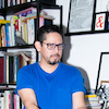
David Berlow, the president of Font Bureau, is a 44-year veteran of the type industry. Beginning his career in 1978 at Mergenthaler-Linotype, Stempel, and Haas, he moved on to one of the first digital type foundries, Bitstream, in 1982. Berlow began consulting and sub-contracting to Apple Computer in 1989, leading development of the era-defining fonts for macOS 7 that introduced the TrueType format, and later the first variable font, Skia. His fonts are distributed by Google, Apple, Microsoft, Adobe, Monotype, Morisawa and Type Network. He has been the recipient of lifetime achievement awards from both the Type Directors Club and the Society of Type Aficionados.
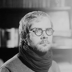
Santiago Orozco is a type designer and engineer, based in Monterrey, Nuevo León, México. With a background in computer science at the University of Monterrey (UDEM), he found himself at the intersection between design and technology. In 2009, he Founded Typemade Foundry, and now specializes in type design, font production, and type technology.
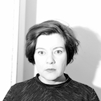
Irene Vlachou is a typeface designer based in Athens, Greece. She holds an MA in Typeface Design from the University of Reading. Irene has collaborated with international type foundries and corporations, working as a typeface designer and a consultant for Greek typefaces. From 2013 to 2019, she was a senior designer and variable font expert at Type-Together. She currently works full time as a freelancer typeface designer specializing in OEM/System fonts. On behalf of the Greek Open Source Community (GFOSS), she is a mentor on the expansion of Greek libre fonts for the GSOC (Google Summer of Code) program. For the spring semester of 2022, Irene is an artist-in-residency at La Becque and a visiting professor at the Master program of Typeface design at ECAL, Lausanne.
Her work includes: Colvert Greek (2012, typographies.fr), Parmigiano Greek (2014, Typotheque), Samsung One Greek (2016, Brody Associates), LL Bradford Greek (2016, identity for Documenta14, Laurenz Brunner), LL Unica77 Greek (2017, Lineto), Stratos Greek (2018, Production Type), FauxFoundry and FauxGreek parametric fonts (2019, self initiated), SauberScript Greek (2020, TypeJockeys), Amstelvar (2020, Font Bureau) and redesign of Roboto and Noto Greek fonts (2021, Google Fonts).
Ilya is a type and graphic designer and teacher, who lives and works in Barcelona. He is a graduate of the Moscow State University of the Printing Arts (2002), where his graduation project was done under the supervision of Alexander Tarbeev. He has a MA degree in type design from the Type & Media programme at the Royal Academy of Art in the Hague (2005).
After completing the programme, he returned to Moscow where he has collaborated with a number of media organizations: Kommersant, Afisha, Moskovskiye Novosti, Bolshoi Gorod and Men’s Health Russia. In 2005–2007 he was art director for Afisha’s city guidebooks, and 2007–2015 he supervised the curriculum in type and typography at the British Higher School of Art and Design in Moscow. He has been sought out as an expert consultant on Cyrillic type design by international foundries since 2008. In 2014 he founded the foundry CSTM Fonts with Yury Ostromentsky, and in 2016 the type.today font store with a focus on Cyrillic typefaces.
Graphic and type designer, co-founder of type.today store. Graduate of the Moscow State University of Printing Arts (Department of Arts and Technical Design of Printed Materials). Yury worked as a designer and art director for publishers and design studios. From 2004 to 2012, he was art director with Bolshoy Gorod (Big City) magazine.
In 2004, he and lya Ruderman, Dmitry Yakovlev, and Daria Yarzhambek launched the DailyType webpage. Later in 2014, Yury and Ilya Ruderman founded CSTM Fonts type design studio which released Pilar, Big City Grotesque, Kazimir, Navigo, Normalidad, RIA Typeface, Lurk, Loos, Maregraph typefaces and CSTM Xprmntl series, as well as Cyrillic versions of Druk, Graphik, Spectral, Stratos and Apoc. The works by Ostromentsky and CSTM Fonts were awarded by European Design Award, Granshan and Modern Cyrillic Competition.
Mikhail Strukov is a type designer and graduate of Ilya Ruderman’s course at BHSAD (Moscow) and Frank Blokland's program at Plantin Institute of Typography (Antwerp), where he developed a deep interest in history of type and evolution of type production. He collaborates with CSTM Fonts and Samarskaya & Partners, working mostly on Cyrillic versions for both custom and retail typefaces. When not busy with designing Cyrillic, he reviews, consults and writes about Cyrillic. A smalltown resident, road cycling fan, and builder of local communities
Similar sans-serif Fonts
Roboto
The quick brown fox jumps over the lazy dog
Christian Robertson, Paratype, Font Bureau
v50
Open Sans
The quick brown fox jumps over the lazy dog
Steve Matteson
v44
Google Sans
The quick brown fox jumps over the lazy dog
v67
Noto Sans JP
The quick brown fox jumps over the lazy dog
v55
Montserrat
The quick brown fox jumps over the lazy dog
Julieta Ulanovsky, Sol Matas, Juan Pablo del Peral, Jacques Le Bailly
v31
Inter
The quick brown fox jumps over the lazy dog
Rasmus Andersson
v20
