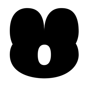
Radio Canada Font
Designed by Charles Daoud, Coppers and Brasses, Alexandre Saumier Demers, Jacques Le Bailly
On Google Fonts since 2022 • Popularity #301
Quick Summary
10
Styles · incl. italic
300-700
Weight Range
2
Variable axes
4
Languages / Subsets
© 2017 The Radio-Canada Project Authors
Font Preview
Search for Google Fonts Like Radio Canada by Image
Radio Canada is one of many popular Google Fonts. Seen something similar? Upload a screenshot to find and download your match.
Search Fonts by ImageAbout Radio Canada Fonts
CBC/Radio-Canada is Canada's national public broadcaster. Their mandate is to inform, enlighten and entertain, in order to strengthen Canadian culture on radio, television and digital platforms.
The Radio-Canada font was created in 2017 by Montreal-based designer and typographer Charles Daoud, in collaboration with Coppers and Brasses and Alexandre Saumier Demers. It was designed specifically for CBC/Radio-Canada as a brand unifying information font for all the Public Broadcaster’s platforms. Fittingly, for a Public Broadcaster, this is a peoples’ font and the humanistic style stands out with distinctive angles and subtle curves. Its x-height ensures excellent legibility and respects digital accessibility standards, making it very effective when used in continuous text.
In 2018, the Radio-Canada font won three awards, in the Font Design category at Communication Arts Typography, Applied Arts Design Annual and at Grand Prix Grafika.
Several optimizations saw the light of day in 2021. The number of supported languages has increased from 106 to 317 Latin languages. In 2023, Jacques Le Bailly (Baron von Fonthausen) expanded the font to include the support of Indigenous languages.
To contribute, see github.com/cbcrc/radiocanadafonts.
To learn more, read You can now use Radio-Canada’s brand typeface: The award-winning variable font comes to Google Fonts (English), Voici Radio-Canada, la police de caractères du diffuseur public canadien, plusieurs fois primée et maintenant disponible sur Google Fonts (French).
Who Designed Radio Canada?
View all designers
Charles Daoud is a multidisciplinary graphic designer and typographer that works with a wide variety of SMEs, large corporations, firms and advertising agencies across the province of Quebec and abroad. He is internationally recognized for his work with major clients, such as Netflix and Brocade, as well as his innovative typefaces, including the ever-popular Dense, which have been downloaded by millions of users. In 2017, he led the development of the Radio-Canada typeface, in collaboration with the public broadcaster - a project that earned him a Grafika Grand Prix as well as not only being published in the Communication Arts Typography Annual, but also making its cover. He was also featured as one of the "15 Canadian Graphic Designers to Follow" by MIJLO, an industry-leading design blog.
Coppers and Brasses is a digital type foundry developing retail and custom typefaces for local and international clients. Based in Montreal, the award-winning foundry was founded in 2011 by Étienne Aubert Bonn and Alexandre Saumier Demers. Their debut retail typeface, Martha, was released in 2012. Étienne now runs the foundry and collaborates regularly with designers and consultants from all around the globe. Their typefaces are meticulously created for print as well as screen use. Coppers and Brasses takes their pride in bringing the the smoothest bezier curves, the most regular rhythm and the nicest text color. They also design bespoke typographic solutions for a variety of clients, either through advertising agencies, creative studios, or directly. Whether it is for a complete typeface family or a lettering piece, they take interest in every project that involves the drawing of letterforms.

Alexandre Saumier Demers is a type designer and sign painter based in Montreal, Canada. He sometimes develops fonts for Coppers and Brasses-foundry he initially co-founded in 2011.
"Baron von Fonthausen, distinctive type design with a twist." Jacques Le Bailly has a broad international experience in the field of type design and a background in graphic design, corporate design, typography and teaching. He specialized in (large) type design projects. Beside developing personal type families, he works for and in cooperation with high profile clients.
Similar sans-serif Fonts
Roboto
Christian Robertson, Paratype, Font Bureau
Open Sans
Steve Matteson
Google Sans
Noto Sans JP
Montserrat
Julieta Ulanovsky, Sol Matas, Juan Pablo del Peral, Jacques Le Bailly
Inter
Rasmus Andersson