Montserrat Underline
Designed by Julieta Ulanovsky, Sol Matas, Juan Pablo del Peral, Jacques Le Bailly
9 weights • Version 3 • On Google Fonts since 2024 • Popularity #1188
Quick Summary
18
Styles · incl. italic
100-900
Weight Range
1
Variable axis
5
Languages / Subsets
© 2011 The Montserrat Project Authors
Font Preview
The quick brown fox
What's That Font? Find Google Fonts Like Montserrat Underline
If you've come across a sans-serif font similar to Montserrat Underline and can't name it, upload your image and we'll match it to the closest free Google Font in seconds.
What's That Font?About Montserrat Underline Fonts
The old posters and signs in the traditional Montserrat neighborhood of Buenos Aires inspired Julieta Ulanovsky to design this typeface and rescue the beauty of urban typography that emerged in the first half of the twentieth century. As urban development changes that place, it will never return to its original form and loses forever the designs that are so special and unique. The letters that inspired this project have work, dedication, care, color, contrast, light and life, day and night! These are the types that make the city look so beautiful. The Montserrat Project began with the idea to rescue what is in Montserrat and set it free under a libre license, the SIL Open Font License.
This is the Underline family, a sister to the normal and Alternates families. This family celebrates a special style of underline that is integrated into the letterforms found in the Montserrat neighborhood.
The Montserrat project is led by Julieta Ulanovsky, a type designer based in Buenos Aires, Argentina. To contribute, see github.com/JulietaUla/Montserrat
Who Designed Montserrat Underline?
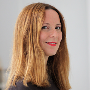
All designersJulieta Ulanovsky lives and works in Buenos Aires. She is a graphic designer and typographer (UBA). In 1989 she founded the ZkySky design studio with Valeria Dulitzky. They specialize in identity design, editorial design, and consulting. She is the co-author of three design books and other typeface design projects linked to urban themes.
Sol lives and breathes type design in her beloved adopted city of Berlin. From her sunny studio, she collaborates with an international type and design community. Type design found and claimed her during her formative years at Universidad de Buenos Aires. She mingled and shared classes with architects, and those technical ideas infused her design methodology with the functional precision of an engineer. After spending time at Saatchi & Saatchi, she set out on her own, and formed a new studio. Client projects have led her to research glyphs for Cyrillic, Greek, Oriya, and Devanagari, uncovering the history and meaning of the strokes.
"Baron von Fonthausen, distinctive type design with a twist." Jacques Le Bailly has a broad international experience in the field of type design and a background in graphic design, corporate design, typography and teaching. He specialized in (large) type design projects. Beside developing personal type families, he works for and in cooperation with high profile clients.
Similar sans-serif Fonts
Roboto
The quick brown fox jumps over the lazy dog
Christian Robertson, Paratype, Font Bureau
v50
Open Sans
The quick brown fox jumps over the lazy dog
Steve Matteson
v44
Google Sans
The quick brown fox jumps over the lazy dog
v67
Noto Sans JP
The quick brown fox jumps over the lazy dog
v55
Montserrat
The quick brown fox jumps over the lazy dog
Julieta Ulanovsky, Sol Matas, Juan Pablo del Peral, Jacques Le Bailly
v31
Inter
The quick brown fox jumps over the lazy dog
Rasmus Andersson
v20


